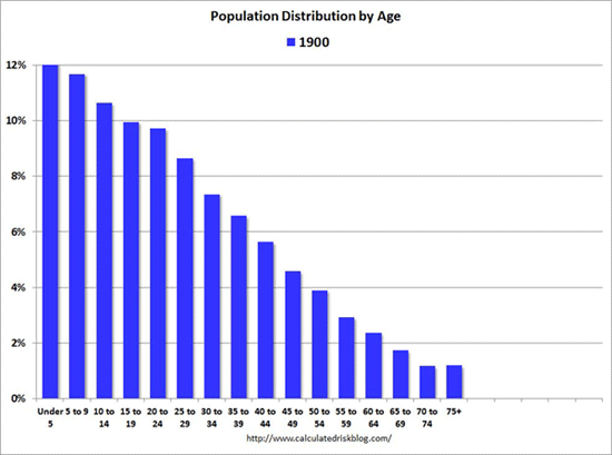
“This is a mesmerizing little animation created by Bill McBride of Calculated Risk. It shows the distribution of the U.S. population by age over time, starting at 1900 and ending with Census Bureau forecasts between now and 2060. As McBride points out, you can see a big ‘baby bust’ before and during the Great Depression, right before prosperity returns and the Baby Boom strikes. (You can also see the bulge of Baby Boomers ripple through the charts in the latter half of the 20th century.)”
This amazing, animated chart shows the aging of America
- Post author:The Freedom Watch Staff
- Post published:August 15, 2013
- Post category:Network Archives
Tags: Bankocracy, CLibertyC, constitutional liberty coalition, economic Trends, Economics, for life and liberty, Investment/Trends, Mainstream News, Resistance, sound money, The Freedom Watch, Welfare-Warfare State
The Freedom Watch Staff
News before it is news for the resistance from a trusted correspondent.
The Freedom Watch Network